Difference between revisions of "SPN"
m |
m (→In Practice) |
||
| Line 51: | Line 51: | ||
I start drawing sketches by hand on a blackboard, or whiteboard to get a first overview and quickly move things around, reconnect and rearrange. A final, handdrawn sketch is fine, if an electronic diagram is required, I find after experimenting with '''many''' alternatives that [https://www.google.ca/slides/about/ '''Google Slides'''] is currently the best tool to develop SPN diagrams. Here is a [https://docs.google.com/presentation/d/1NM02aTA0wC5CCPsl1tIKlgnR4MUHgwd9645f6Ne0yLc/edit?usp=sharing '''link to a SPN template'''] that you can copy and use for your own diagrams. | I start drawing sketches by hand on a blackboard, or whiteboard to get a first overview and quickly move things around, reconnect and rearrange. A final, handdrawn sketch is fine, if an electronic diagram is required, I find after experimenting with '''many''' alternatives that [https://www.google.ca/slides/about/ '''Google Slides'''] is currently the best tool to develop SPN diagrams. Here is a [https://docs.google.com/presentation/d/1NM02aTA0wC5CCPsl1tIKlgnR4MUHgwd9645f6Ne0yLc/edit?usp=sharing '''link to a SPN template'''] that you can copy and use for your own diagrams. | ||
| + | |||
| + | {{Vspace}} | ||
<table> | <table> | ||
| Line 75: | Line 77: | ||
</tr> | </tr> | ||
<tr> | <tr> | ||
| − | <td align="right | + | <td align="right">Worst</td> |
| − | <td | + | <td> |
*Wordy and redundant labels (Retrieve.sequence.from.NCBI) | *Wordy and redundant labels (Retrieve.sequence.from.NCBI) | ||
*Duplicate labels; | *Duplicate labels; | ||
| Line 104: | Line 106: | ||
</tr> | </tr> | ||
<tr> | <tr> | ||
| − | <td | + | <td>Worst</td> |
| − | <td | + | <td> |
*Unnecessarily crossing lines; | *Unnecessarily crossing lines; | ||
*Connectors attached to corners or the wrong side of elements. | *Connectors attached to corners or the wrong side of elements. | ||
Revision as of 13:36, 2 February 2016
SPN
Structured Process Notation
SPN (Structured Process Notation) is a lightweight, expressive notation for the design of dataflow diagrams.
Introduction
Engineering workflow-centric software for research laboratories requires transparent, high level models to structure the design and to document the overall organisation of the code. However current methodologies are not well suited for this task, focussing on the implementation of objects rather than on the integration of functions and suffering from poor information design principles. SPN (Structured Process Notation) is an intuitive, lightweight alternative loosely based on SADT / IDEF0. SPN is intuitive by consistently applying a directional metaphor that is close to implementation, expressive by using icons and avoiding any superfluous elements, simple by minimizing the number of symbols and using explicit annotations, granular by supporting multiple levels of detail through nesting, and extensible.
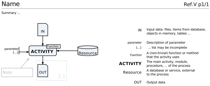
The core SPN elements and their general layout. Icons are drawn on the left of the page, labels and descriptions on the right. Fonts may be formatted to emphasize correspondence. Input data enters an activity from the top, parameters from the left, database, libraries, services, repositories and similar resources from the right and output data leaves the activity at the bottom. Connections are drawn with black lines and all other lines in the diagram are not black to make them visually distinct. An activity can be annotated with functions, methods or algorithms. Notes and comments can be added for clarification, they are formatted in grey, the sense of their pointing arrows is always against the dataflow and these arrows are not connected to icons, to avoid confusion. A pale dotted line groups elements that are described in greater detail elsewhere, a reference is included. All elements of the diagram are optional. A Name for the process and a versioned reference ID (process prefix, number, version, page). The page number is optional for a single-page diagram. A summary at the top may be useful.
Features include:
- A structured, spatial organization of components intuitively depicts data flow.
- Information is not implicit in a complex grammar of symbols but made explicit; the set of symbols that are used is small and they are iconic, i.e. their shape is related to their semantics.
- SPN's process-centric view of data flow is close to implementation.
- Icons are separated from text to allow uncluttered spatial representation of relationships, but explicit descriptions are available on the diagram by placing elements and descriptions at corresponding heights on the diagram and relating them through mnemonic labels.
- Nesting of diagrams is encouraged. Expanding procedures at a higher level of granularity into more detail in a separate diagram structures the components of the workflow without overloading individual diagrams with too much detail.
Elements
- SPN Elements
In Practice
I start drawing sketches by hand on a blackboard, or whiteboard to get a first overview and quickly move things around, reconnect and rearrange. A final, handdrawn sketch is fine, if an electronic diagram is required, I find after experimenting with many alternatives that Google Slides is currently the best tool to develop SPN diagrams. Here is a link to a SPN template that you can copy and use for your own diagrams.
| Labels | |
| Good |
|
| Bad |
|
| Worst |
|
| Connectors | |
| Good |
|
| Bad |
|
| Worst |
|
| Color | |
| Good |
|
| Bad |
|
| Worst |
|
| Even Worse than Worst |
|
Further reading and resources
- An SPN Google Slide template
- Wikipedia article on SADT
- Wikipedia article on IDEF0 IDEF0, a successor to SADT.
